3 Common Space Planning Mistakes & How to Avoid Them
So, first off - what is space planning? Simply, its how the space in your home is organized - both as rooms/walls/fixtures as well as furniture layout within the rooms. I’m going to be specifically talking about common furniture layout mistakes - so let’s hop right into it!
1) Furniture that is too large for the space - this happens so frequently it doesn’t even surprise me anymore, and is one of the most frequent reasons I’ve had clients hire me (“I’ve already bought and returned X number of pieces because they didn’t fit!”). The good news is that the solution to this is fairly easy - before ordering any furniture, use painters tape to mark out the dimensions of the piece on the floor. If it blocks any doorways or walkways - or makes it so you have less than 24” (the bare minimum, in my opinion) to navigate around the room, then you need to find a smaller option. Do not wait until you get to the store and “eyeball it.” Because furniture stores are often very large, open spaces - pieces always feel smaller at the store than they will in your home where the walls and ceiling are much more in scale with the piece. (Bonus Tip: measure doorways and halls to make sure your piece can be moved into the room - don’t pull a Friend’s “PIVOT!” moment.)
BEFORE: this client had an oversized sectional (to their credit - it was from a previous home) and it took over the space. AFTER: During our Design Jumpstart, we focused on creating an optimal layout for the space, including determining dimensions for pieces. She took that plan shopping and now the scale of the furniture is much more appropriate and actually makes the space feel larger.
2) Too much furniture - it is tempting to add more furniture to create more storage or because you feel like the space is being wasted, but it is one of the biggest mistakes when space planning and causes the room to feel cluttered/overwhelming. This doesn’t even delve into the fact that sometimes adding more storage puts a band-aid on a larger problem of having too much stuff. Too many pieces can crowd circulation paths (how you move through the space), block windows/natural light, make a space feel smaller than it is, and it adds to the amount of “stuff” you have to maintain.
If you are worried that you have too much furniture in a space, it is best to start with a blank slate. Ideally, remove everything from the room to begin with and slowly/deliberately move pieces back in. The best way to approach it is to consider what your absolute must have pieces are, and move those in first (typically these are the larger items - sofa/TV in a living room, bed/dresser in a bedroom). Now, move in smaller but still needed items (coffee table/side tables, night stands/lamps). Once the room feels functional and complete - stop adding more stuff. (Note: I have never found that a rug adds to the “too much” rule - so move that one in first). If you can’t move everything out, drawing it on graph paper is a good alternative. Remember: negative space (space where there is nothing) is just as important as positive space in design.

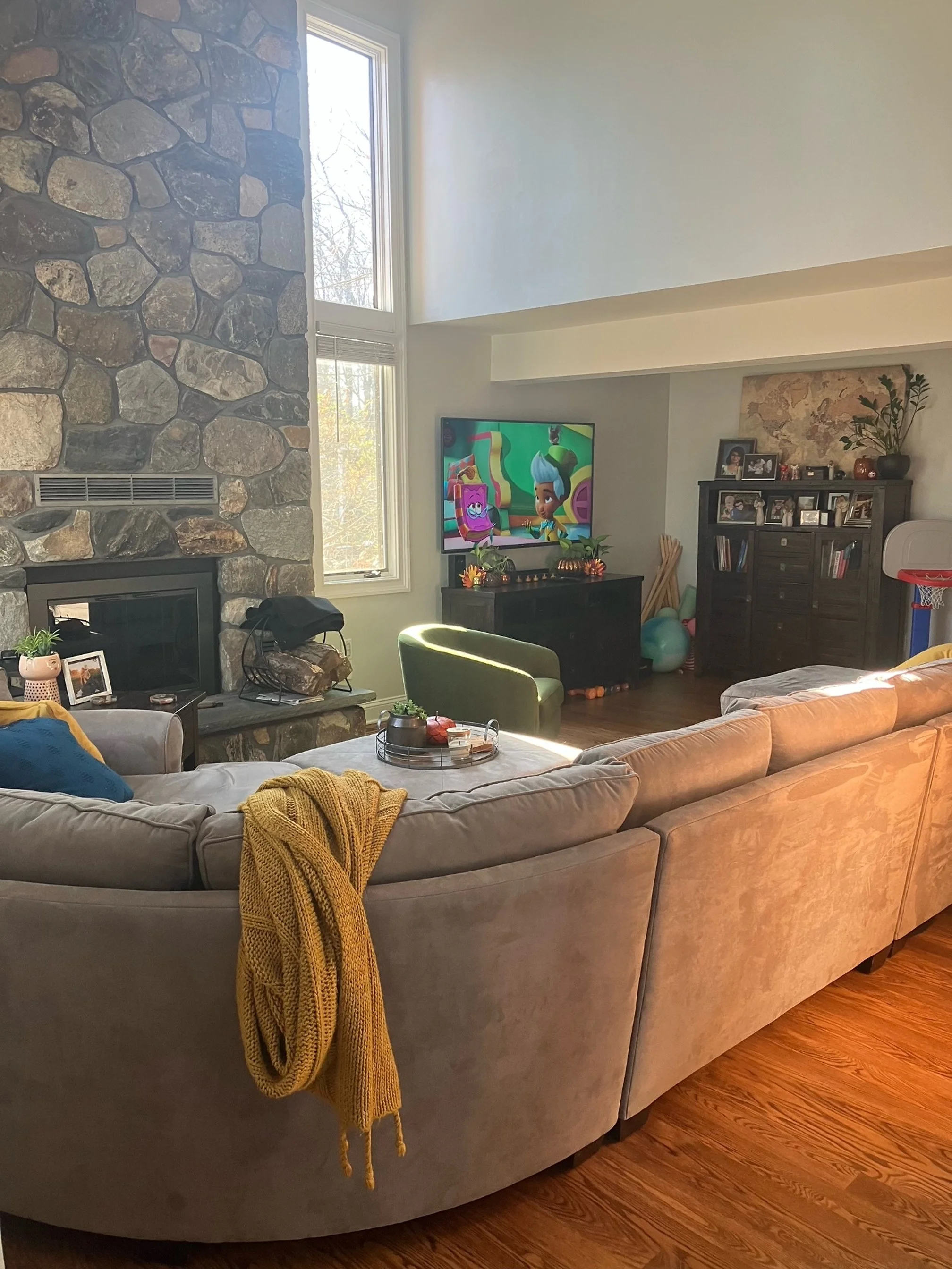
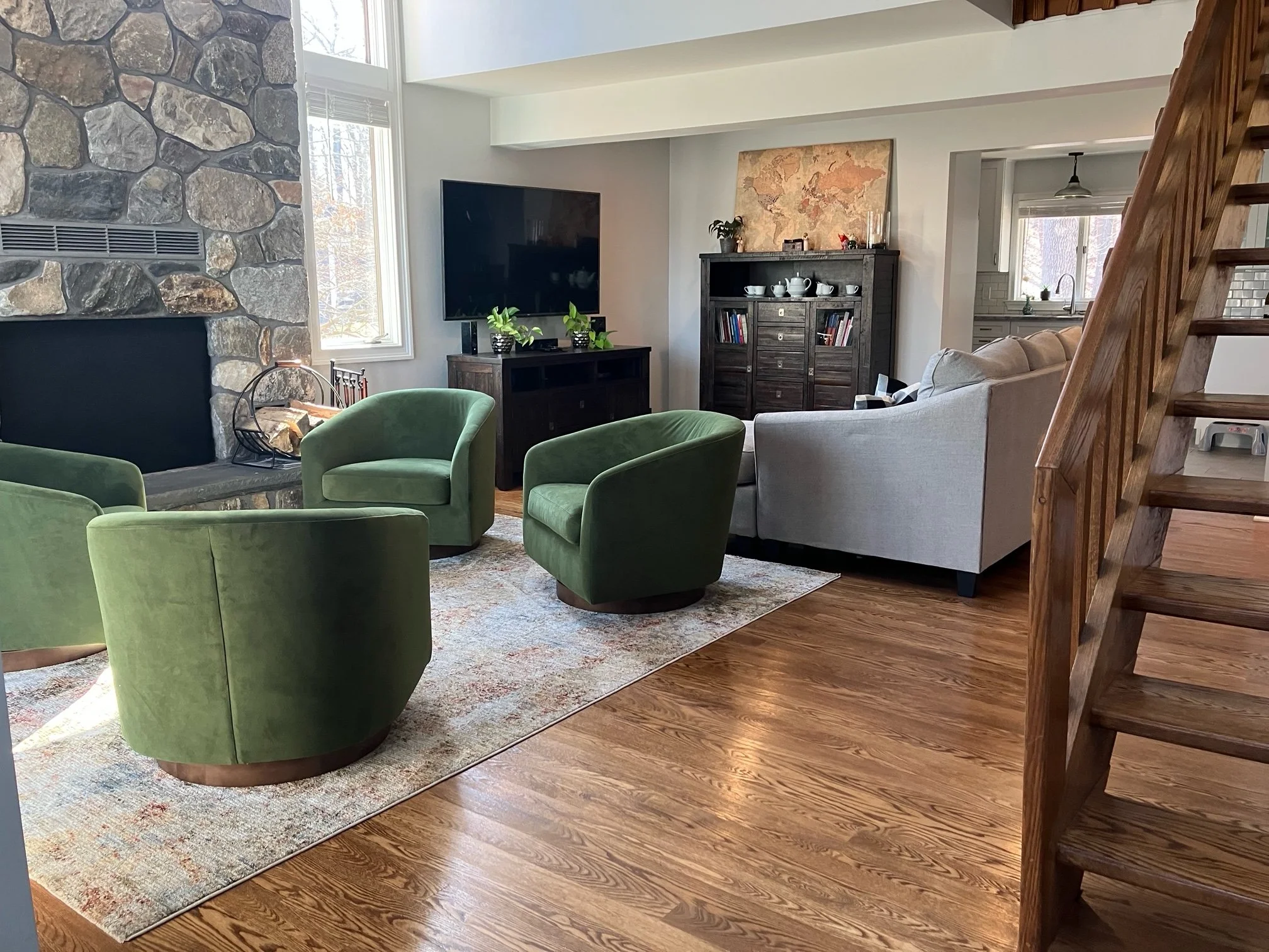
Before: This living room is crowded with too many pieces of furniture - it makes it crowded and you can imagine how difficult it would be to walk around the space. After: Removing one of the sofas and rearranging the chairs, helps open up the space and keeps it from feeling overwhelming. It also makes the space feel larger and you can more easily see the beautiful millwork. (Side note: adding a rug helps group the furniture together and pulls it together).
3) Disruptive or unclear circulation paths (how you walk through/around the room) - The majority of issues with circulation (ie walkways) are caused by the two previous mistakes, but can also happen because of how your furniture is arranged. One example of this is when you layout the furniture in such a way that you have to walk between the TV and the sofa to move through the room. Sometimes, there is no other way to arrange the furniture and it has to be done, but generally this isn’t the case. When you are considering how you are going to layout the furniture in your space, consider how someone will get from point A to point B within the room - particularly if you have multiple entry/exit points to the space. If someone is walking through the space, make sure they won’t be walking between the sofa and the TV. See the images below for an example of this and a solution. If you look at your space and there isn’t a clear way to navigate through it, that is also a concern that needs to be addressed.


Before: In the first layout, anyone walking through the room has to walk directly in front of the TV. After: In the second layout, users can walk behind the sofa and chair to move through the space without blocking the TV (or disrupting any conversations). This layout also allows users a better view of the window - which is great if you have a nice view. Note that both rooms have the same number of pieces - they’re just arranged in a different way.
If you are struggling with your layout and you still aren’t sure how to fix it, I would love to help you problem solve some solutions with a Design Jumpstart. Use the button at the top of the site to schedule a complimentary Discovery Call where we can discuss your needs and the process in more detail.